Apple Relay
Third party in-store retail experience
Apple sets the bar for in-store experience. Here's how I made sure every interaction met it.
MEET MAC: IN-STORE EXPERIENCE
CONTEXT
Mac pricing and specs were communicated through paper table cards in third-party retail stores. The goal was to replace them with an experience that lived on the Mac itself.
I worked closely with one other designer. She led the overall visual design, and I owned the interaction layer, collaborating on layout decisions throughout.
The core constraint was specific: a widget sitting on the Mac's desktop had to open into a fuller experience. How it expanded, how it closed, how it behaved on a device people were actively exploring, shaped every decision we made.
THE PROBLEM
The landing page led with what people actually come to find: model name, price, and key specs like GPU, SSD, and payment options.
From there, a view models screen let people compare configurations side by side across the lineup, which was the clearest way to present options without overwhelming the user.
THE EXPERIENCE

View Models: Comparison across the product lineup. The stacking configurations was the clearest way to present the options without overwhelming the user.

Landing page: The first view led with model name, price points, and key specs: GPU, SSD, and payment options.
This is where most of my work lived. The opening had to be fast and clean, with no room to be clever, given the platform constraints.
Color transitions use a fade instead of a hard switch. A hard switch felt cheap. The fade is what carries most of the premium feel in this interaction.
The modal slides down to open and back up to close, so nothing feels jarring. The header moves behind the second plane as it opens, then reappears, fading in.
The user is there for the product, not the interface. If they notice the interaction, we've done something wrong.
DESIGN DECISIONS - INTERACTIONS
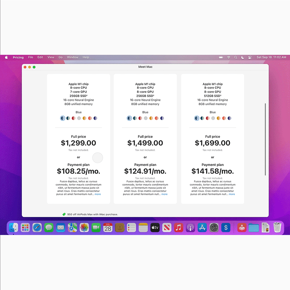
View colors: A fade instead of a hard switch. The difference between feeling considered and feeling cheap.

Opening: Fast and clean. Platform constraints shaped the decision: no room to be clever.

Header: The header moves behind the second plane, and reappears fading in on the second plane.
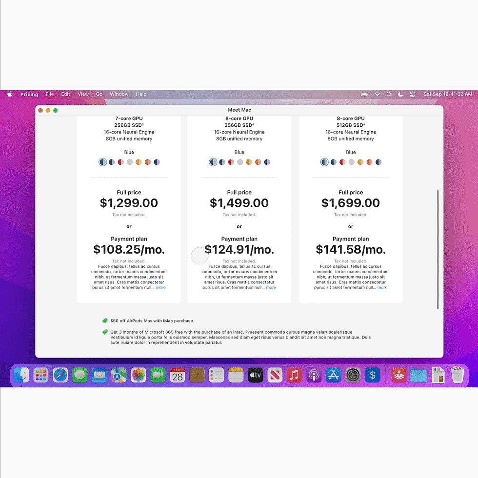
Modal: Slides down to open, back up to close. Nothing jarring.
The experience shipped as part of the Mac in-store refresh. I wasn't privy to the results, but I can speak to the standard we held to: every transition had to be right. The interaction layer and the layout weren't separate problems. The right interaction is the one you don't notice.
OUTCOME
I'd want to see someone actually use it in store. Interaction timing is something you tune by watching people, not by reviewing specs.