Apple Relay
Internal asset management platform
The clock starts when Tim Cook leaves the stage. Here's how I made sure language choice didn't slow anyone down.
MULTI-LANGUAGE SELECTION
CONTEXT
Relay is Apple's platform for third-party marketing partners, agencies, mom-and-pop shops, and big box retailers to download product assets. Partners don't get assets until a launch is already live. There's no advance notice; the clock starts the moment Tim Cook walks off stage. By the time someone logs in, they're already behind and there's no room to figure things out.
Relay had been built for a single language. When it expanded into multilingual markets, adding language support seemed straightforward on the surface. Where that selection should live in the flow took longer to figure out.
The problem was how to add multiple languages while making sure the system still felt fast and obvious for users who were already under pressure. Adding friction in the wrong place meant the whole thing would fall apart.
THE PROBLEM
Three options:
-
Multi-site, multi-login: separate sites, separate passwords. Partners are already managing a launch. Now they're managing credentials too.
-
Multi-site, single login: one password, but assets and notifications are split across sites.
-
Single site, single login: everything in one place.
Two multi-site directions were on the table. One kept a single login across sites but still split assets and notifications by language site. The other gave each language site its own login entirely.
Both raised the same open questions: how partners navigate between sites without confusing site language with asset language, how sites communicate when an asset is sent or updated, what happens to download times across multiple sites, and how many times a partner has to add the same asset to their library just because it exists in more than one language.
WHAT I CONSIDERED
I pushed for a single site, single login instead. One login, one homepage, with languages living inside it rather than splitting the site itself.
That matches how partners already use most software: one login, one password, communication contained in one place, and assets added to the library once regardless of how many languages they come in.
The homepage and library page ended up with different jobs. The homepage's one task is surfacing which product kit a partner needs. Language stays out of that decision entirely, so partners aren't sorting through language before they even know what they're downloading. The library page is where partners already make decisions about what to download, so that's where the language choice belongs. On load, partners can see exactly what language assets they have.
DESIGN DECISIONS
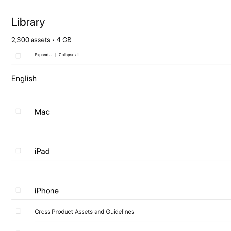
Library: Language is the first thing partners see on load.
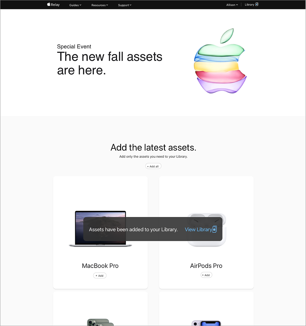
Homepage: Language removed from the first decision point.
-
Fewer steps to reach assets during a launch
-
Language selection moved to where users are already making decisions
-
Stakeholders aligned on a single-site approach
No launch numbers. This shipped ahead of the moment it was built for, so I can't speak to how it performed live. Stakeholders backed the direction, and nothing came back once it was built. That was enough to trust the decision and move forward.
OUTCOME
Taking the language decision off the homepage entirely, and putting it on the library page instead, was the right call.
I'd still want more partner types represented in the research that shaped that decision. Big box retailers gave a clear signal, but that's one slice of who uses Relay.